

"Cubilia a nisi blandit sem cras nec
temport adipiscing rku ullamcorper ligula."
JOHN DOE / CEO Elessi
html {
height: 100%;
}
body {
min-height: 100%;
}
body{
font-family: Arial, Helvetica, sans-serif;
color:#353D41;
background-color: #fff;
}
header{
height:100px;
background-image: linear-gradient(-180deg, #353D41 0%, #3e4b51 97%);
/* background: #353D41; */
width:100%;
text-align: center;
}
header img{
margin-top:20px;
display: inline-block;
}
.cf{
clear: both;
}
.item-container{
max-width: 1100px;
margin:45px auto 0 auto;
padding-bottom: 45px;
}
.item-container .image-container{
width:30%;
float:left;
}
@media only screen and (max-width: 600px) {
.item-container .image-container{
width:100%;
}
.item-container{
padding:0 20px 45px 20px;
}
}
.item-container .image-container img{
max-width: 400px;
width:100%;
height:auto;
display: inline-block;
}
.item-container .title-container{
width:calc(70% – 25px);
margin-left:25px;
float:left;
padding-top: 12px;
}
@media only screen and (max-width: 600px) {
.item-container .title-container{
width:100%;
margin-left:0;
text-align: center;
}
}
.item-container .titles{
width:calc(85% – 25px);
float:left;
}
@media only screen and (max-width: 600px) {
.item-container .titles{
width:100%;
}
}
.item-container .icon{
width:calc(15%);
float:left;
margin-right: 25px;
text-align: center;
}
@media only screen and (max-width: 600px) {
.item-container .icon{
display:none;
}
}
.item-container .icon img{
width:100%;
max-width: 100px;
margin-top: 40px;
max-height: 80px;
display: inline-block;
height:auto;
}
.item-container .title-container h3{
font-size: 26px;
margin-bottom: 7px;
line-height: 34px;
}
.item-container .title-container h4{
font-size: 18px;
font-weight: bold;
margin-top: 10px;
margin-bottom: 0px;
}
.item-container .title-container h5{
font-size: 16px;
font-weight: normal;
margin-top: 10px;
margin-bottom: 0px;
}
.item-container .upper-container{
width:100%;
float:left;
}
.item-container .details-container{
width:100%;
margin-top: 25px;
padding-top: 25px;
box-shadow: 0 -1px 0 0 #ccc;
float:left;
min-height: 20px;
}
.item-container .details-container .specs{
width:25%;
float:left;
}
@media only screen and (max-width: 600px) {
.item-container .details-container .specs{
width:100%;
}
}
.item-container .details-container .specs.no-spec{
display:none;
}
.item-container .details-container .specs ul{
padding-left: 0px;
margin-top: 0;
}
.item-container .details-container .specs ul li{
font-size: 20px;
list-style: none;
margin-bottom: 5px;
}
.item-container .details-container .specs ul li span{
font-weight:bold;
}
.item-container .details-container .func-inc{
width:calc(33% – 50px);
margin:0 25px;
float:left;
}
@media only screen and (max-width: 600px) {
.item-container .details-container .func-inc{
width:100%;
margin:0;
}
}
.item-container .details-container .func-inc .func{
width:100%;
float:left;
}
.item-container .details-container .func-inc .inc{
width:100%;
float:left;
margin-top: 25px;
/* padding-top: 25px; */
/* box-shadow: 0 -1px 0 0 #ccc; */
}
.item-container .details-container .condition{
width:41%;
float:left;
}
@media only screen and (max-width: 600px) {
.item-container .details-container .condition{
width:100%;
margin-top:20px;
}
}
.item-container .details-container .condition.no-spec{
width:46%;
}
@media only screen and (max-width: 600px) {
.item-container .details-container .condition.no-spec{
width:100%;
}
}
.item-container .details-container h4{
margin-top: 0;
margin-bottom: 17px;
font-size: 17px;
/* color:#CB2D3E; */
font-style: italic;
}
.item-container .details-container h4:after {
content: “”; /* This is necessary for the pseudo element to work. */
display: block; /* This will put the pseudo element on its own line. */
width: 42px; /* Change this to whatever width you want. */
padding-top: 3px; /* This creates some space between the element and the border. */
border-bottom: 2px solid #71BE9B; /* This creates the border. Replace black with whatever color you want. */
}
.item-container .details-container p{
font-size:20px;
}
.item-container .details-container .condition .grade{
width:100px;
height:100px;
border-radius:50px;
font-size:42px;
font-weight: bold;
color:#fff;
line-height:100px;
text-align:center;
/* background-image: linear-gradient(-180deg, #353D41 0%, #3e4b51 97%); */
background: #71BE9B;
}
.item-container .details-container .condition .grade-container{
width:100px;
float:left;
margin-right: 20px;
}
@media only screen and (max-width: 600px) {
.item-container .details-container .condition .grade-container{
width:100px;
float:none;
margin:0 auto;
}
}
.item-container .details-container .condition .description-container{
width:calc(100% – 120px);
float:left;
}
@media only screen and (max-width: 600px) {
.item-container .details-container .condition .description-container{
width:100%;
float:left;
}
}
.item-container .details-container .condition .description-container ul{
padding-left: 20px;
margin-top: 7px;
}
.item-container .details-container .condition .description-container li{
font-style: italic;
font-size: 17px;
}
.item-container .additional-details-container{
width:100%;
margin-top: 25px;
padding-top: 25px;
box-shadow: 0 -1px 0 0 #ccc;
float:left;
min-height: 20px;
}
.item-container .additional-details-container h4{
margin-top: 0;
margin-bottom: 22px;
font-size: 17px;
/* color:#CB2D3E; */
font-style: italic;
}
.item-container .additional-details-container p{
font-size: 17px;
line-height:22px;
}
.item-container .additional-details-container li{
font-size: 17px
}
.item-container .additional-details-container h4:after {
content: “”; /* This is necessary for the pseudo element to work. */
display: block; /* This will put the pseudo element on its own line. */
width: 42px; /* Change this to whatever width you want. */
padding-top: 3px; /* This creates some space between the element and the border. */
border-bottom: 2px solid #71BE9B; /* This creates the border. Replace black with whatever color you want. */
}
.item-container .bottom-container{
width:100%;
margin-top: 25px;
padding-top: 25px;
box-shadow: 0 -1px 0 0 #ccc;
float:left;
min-height: 20px;
}
.item-container .bottom-container li{
font-size: 17px
}
.item-container .bottom-container h4{
margin-top: 0;
margin-bottom: 22px;
font-size: 17px;
font-weight: bold;
font-style: italic;
}
.item-container .bottom-container p{
font-size: 15px;
line-height: 20px;
}
.item-container .bottom-container li{
font-size: 15px;
line-height: 20px;
}
.item-container .bottom-container h4:after {
content: “”; /* This is necessary for the pseudo element to work. */
display: block; /* This will put the pseudo element on its own line. */
width: 42px; /* Change this to whatever width you want. */
padding-top: 3px; /* This creates some space between the element and the border. */
border-bottom: 2px solid #71BE9B; /* This creates the border. Replace black with whatever color you want. */
}
.item-container .bottom-container .os{
width:calc(50% – 20px);
margin-right: 40px;
float:left;
}
@media only screen and (max-width: 600px) {
.item-container .bottom-container .os{
width:100%;
margin-right: 0px;
float:left;
}
}
.item-container .bottom-container .os.no-os{
display:none;
}
.item-container .bottom-container .shipping{
width:calc(50% – 20px);
float:left;
}
@media only screen and (max-width: 600px) {
.item-container .bottom-container .shipping{
width:100%;
margin-top: 20px;
}
}
.item-container .bottom-container .shipping.no-os{
width:100%;
}
.item-container .bottom-container .warranty{
width:100%;
margin-top: 40px;
float:left;
}

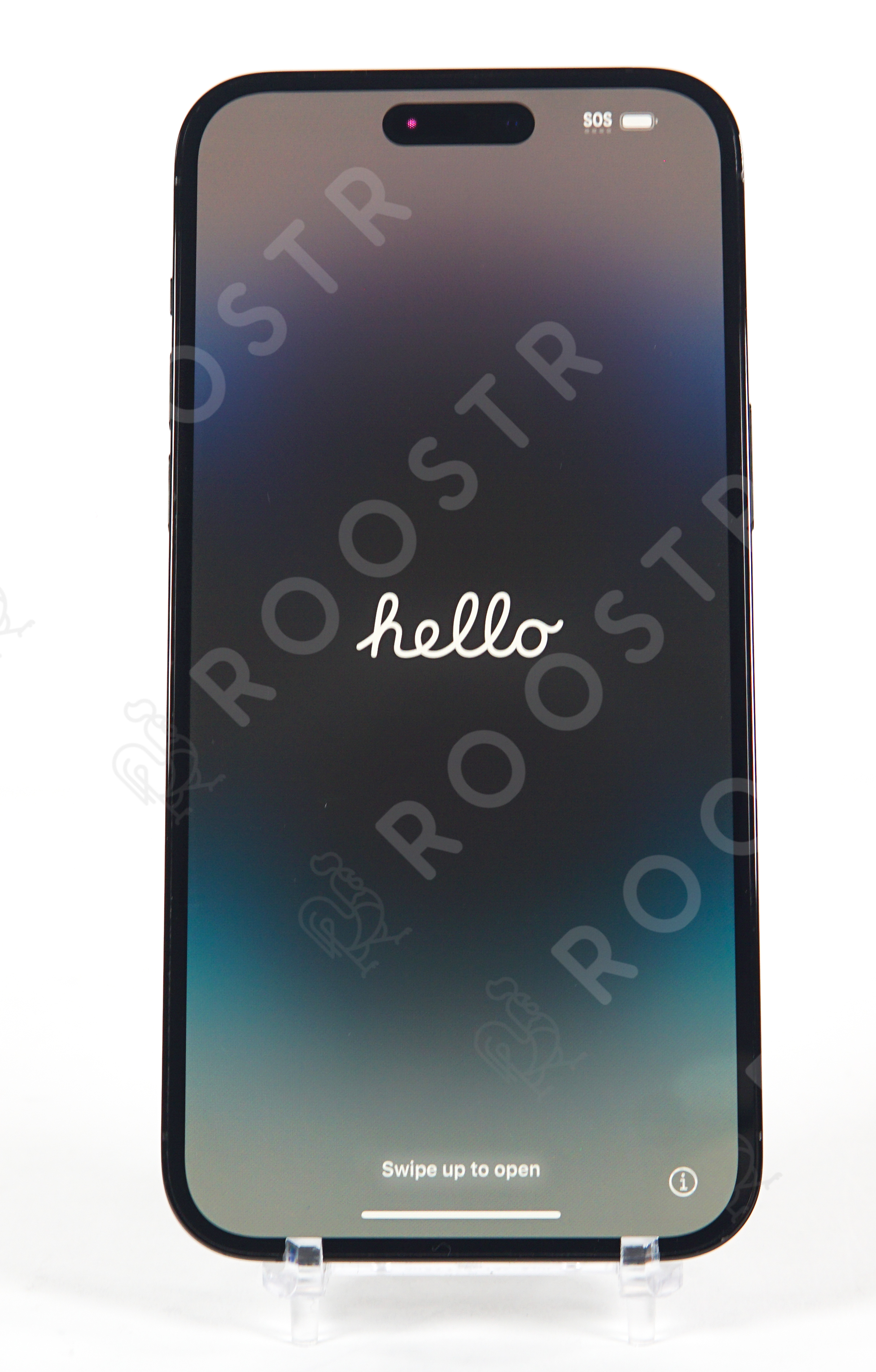

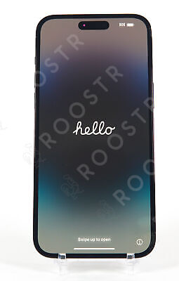
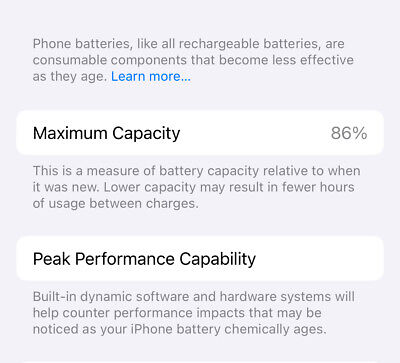
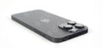
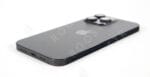
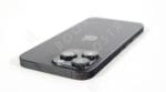
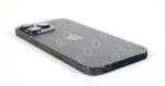
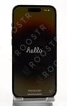
100% fully functional and tested by our Apple Certified Technicians
Box (not original) and Charger
Buy with confidence from a trusted seller. We guarantee your satisfaction and that you will get exactly what you purchased!
| Processor | Hexa Core |
|---|---|
| Chipset Model | Apple A16 Bionic (4 NM) |
| Network | Unlocked |
| Operating System | iOS |
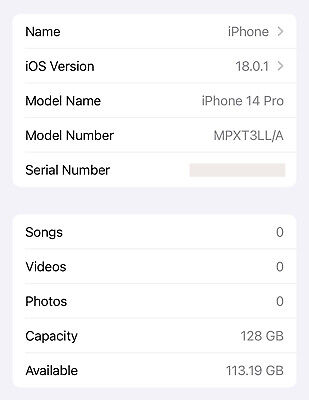
| Storage Capacity | 128 GB |
| Camera Resolution | 48 MP |
| Screen Size | 6.1 in |
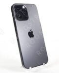
| Color | Black |
| Brand | Apple |
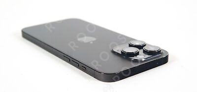
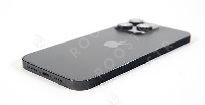
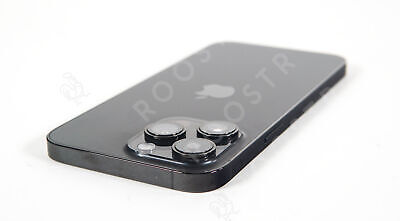
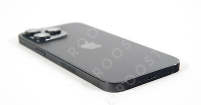
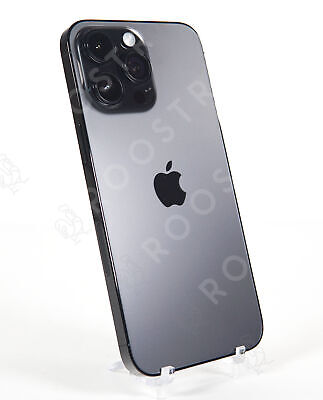
| Model | Apple iPhone 14 Pro |
| Connectivity | Lightning, NFC, Glonass, GPS, Bluetooth, Wi-Fi, Galileo |
| RAM | 6 GB |
Only logged in customers who have purchased this product may leave a review.
In stock
In stock
In stock
In stock
In stock
In stock










Reviews
There are no reviews yet.